Cloud theme · Interface conformance report
An audit of the Trường Số CRM interface against the Cloud design system at roadmap.flyer.vn/cloudtheme. The document records the deviations found, how each group was handled and the values measured after the fix.
Key facts, origin and limits
build cho anh một version cloudtheme UI/UX 100% giống system design này https://roadmap.flyer.vn/cloudtheme, làm theme default của truongso.net tại git này https://gitea.flyer.vn/flyer/center-crm-frontend và đẩy lên https://dev.crm.flyer.us/vi/dashboard luôn cho anh xem thử nha
this theme https://dev.crm.flyer.us/vi/dashboard/cloudtheme need to be consistent and 100% follow documents and system design Cloudtheme here https://roadmap.flyer.vn/cloudtheme (pop-up, notes, annotation, anything....) For example, this one is Cloud consistent: https://enterprise.flyer.vn/app/
anh muốn theme màu cần quality chất lượng của Apple, check lại màn này thử xem sao nhé
Written by an AI assistant within the same working session, based on: the Cloud specification at roadmap.flyer.vn/cloudtheme (including its four reference frames trang-chu, hoc-sinh, lop-hoc, giao-bai), the enterprise.flyer.vn/app application for components the specification does not cover, and a direct reading of the center-crm-frontend codebase.
This is a record of the current state and a proposal, not a final decision. The three items in section 7 remain open.
Sources
- Every measurement in this document was taken with
getComputedStyleon a running build, not inferred from source. The illustrations use sample data; the figures shown are not any centre's real numbers. - Verification method in section 7: Verification ran through Playwright against a running build, with a request mock layer standing in for staging. Each screen was opened, driven to reveal its overlay, captured, and read for the computed values under review.
Limits
- Deployment status (as of the last update of this document):
Batch Contents Branch Status PR #65 Cloud becomes the default theme; each theme gets its own address at /vi/dashboard/<theme>; adds the classic theme built from the truongso.net/crm prototypefeat/cloud-theme-uiintodevmerged 12/09/2026 PR #66 The palette remap; nine overlay and form components; three dashboard corrections feat/cloud-theme-uiintodevpending merge Merge rights on the
devbranch are limited to a single account under the Gitea branch protection settings. Once PR #66 is merged, the pipeline carries the change to dev.crm.flyer.us within about two minutes, and the 24-screen verification will be run again directly against the dev environment.
1Scope and source of truth
Cloud is the design system FLYER publishes at roadmap.flyer.vn/cloudtheme, adopted as the default interface of Trường Số CRM. The specification fixes five purple shades, a neutral set, four status colours, the display density, and the shape of the basic components. Its stated mandatory principle is that the theme changes presentation only, leaving icons, navigation order, feature names and task flows untouched.
The specification fully describes the sidebar, cards, tables, buttons, status labels, tabs and the modal dialog. Several components are absent: dropdown menus, toasts, tooltips, drawers, the command palette, switches, progress bars and callout boxes. For these, the document treats enterprise.flyer.vn/app as the reference, since it is a running product built on the same system.
What was audited
- 24 screens and overlays: the dashboard, customer list and detail, data import, calls, placement tests, five settings pages, account, sign-in, sign-up, plus the menu, dialog, drawer, command palette and toast overlays.
- Both the vi and en locales share one set of presentation rules; the audit was carried out on the Vietnamese build.
- Out of scope: the remaining themes (classic, navy, emerald, sunset, rose, amber, light, dark) are unchanged and unaffected.
2Deviations found
The first pass applied Cloud at the token layer and across the shared components. That reached the product shell, but most of the business interface is written directly in Tailwind utility classes and therefore never received the theme's tokens. A count over the codebase shows 2,010 hard-coded palette utilities, 1,423 of them in the slate ramp — a blue-leaning grey the Cloud system does not contain.
| Group | Symptom | Count | Effect |
|---|---|---|---|
| Hard-coded ramps | slate, emerald, blue, red, amber, indigo written straight into the interface code | 2,010 uses | Secondary text, borders and fills drift off the Cloud neutrals on most business screens |
| Label shape | Status labels fully rounded instead of a small radius | all labels | Against the specification's small-radius label rule |
| Elevation | Cards and tables carry shadow utilities | 71 uses | The specification states cards carry no shadow |
| Corner radius | 14 px to 18 px on cards and tiles | 75 uses | The system uses only 8 px, 10 px and 14 px, by role |
| Gradients | Account header band, owner badges, the sign-in button | 12 uses | The system has no gradients |
| Form fields | Grey fill, no border, 44 px tall | 16 uses | The system specifies a white fill, a hairline border and a uniform height |
| Unstyled components | Toast, tooltip, drawer, command palette, switch, progress bar, callout | 9 components | Left at the component library's defaults |
| Charts | Fixed colours for the won and lost series; gold, silver and bronze medal bars | 3 charts | Outside the system's palette |
3How it was handled
Editing 2,010 uses across roughly sixty files is laborious and easy to get wrong. Tailwind version 4 resolves every palette class through a --color-<ramp>-<shade> variable, so the chosen approach was to redefine those variables within the Cloud theme's scope. The interface code is untouched; the colours are redirected at the token layer.
| Tailwind ramp | Mapped to | Basis |
|---|---|---|
slate, gray, zinc, neutral, stone | The Cloud neutrals, #1b1b1f through #fafafa | The four neutral swatches the specification declares |
blue, sky, cyan, indigo, violet, purple, fuchsia, pink | The five brand purples | The specification states the default blue is fully replaced, and reserves purple for brand information |
green, emerald, lime, teal | #127a41 on #e6f6ec | The "good" status colour |
amber, yellow, orange | #92600a on #fdf3e0 | The "needs attention" status colour |
red, rose | #b42318 on #fdeaea | The "warning" status colour |
Utilities that carry an opacity suffix are inlined by Tailwind as literal colours rather than read through the variable, so the ones the codebase actually uses are restated separately with color-mix. Every rule sits inside the html.cloud scope, so the other themes are unaffected.
Two cascade details, recorded in the source
- A utility carrying
!can only be outranked by another important rule that comes later inside the same@layer utilities. An important rule declared outside the layer loses. backdrop-filter: nonedoes not remove the blur, because the utility also sets the-webkit-prefixed alias. The fix is to reset the--tw-backdrop-blurvariable to empty instead.
4Token conformance
The "measured" column was taken with getComputedStyle on a running build. The "result" column separates what is already live on dev from what is still held in PR #66.
| Item | Cloud specification | Measured | Result |
|---|---|---|---|
| Primary | #6A309B | #6a309b | live on dev |
| Workspace background | #fafafa | #fafafa | live on dev |
| Primary text | #1b1b1f | #1b1b1f | live on dev |
| Secondary text | #71717a | #71717a | live on dev |
| Border | #e4e4e7 | #e4e4e7 | live on dev |
| Soft purple fill | #F3EBFA | #f3ebfa | live on dev |
| Card | 1 px border, 10 px radius, no shadow | 1px #e4e4e7 · 10px · none | live on dev |
| Button | uniform height, 8 px radius | 36px · 8px | live on dev |
| Table row | 44 px tall, 12 px uppercase column headers | 44px · 12px uppercase | live on dev |
| Sidebar | 292 px wide, active item on a soft purple fill | 292px · #f3ebfa | live on dev |
| Grey in interface code | #71717a | #71717a (dev currently #62748e) | PR #66 |
| Status label | 6 px radius, 11.5 px type | 6px · 11.5px | PR #66 |
| Form field | white fill, #d4d4d8 border, 8 px radius | #fff · #d4d4d8 · 8px · 36px | PR #66 |
| Dialog | 14 px radius, rgba(24,24,27,.45) overlay | 14px · rgba(24,24,27,.45), no blur | PR #66 |
| Toast | per the enterprise reference: dark, 10 px radius | #1b1b1f · 10px, bottom right | PR #66 |
| Utility shadows | none | 0 elements still carrying one | PR #66 |
5Six screens, before and after
Captured at 1440 px wide, on the same sample data, through the same harness. The "before" images were built from the exact commit running on dev; the "after" images from the feat/cloud-theme-ui branch.
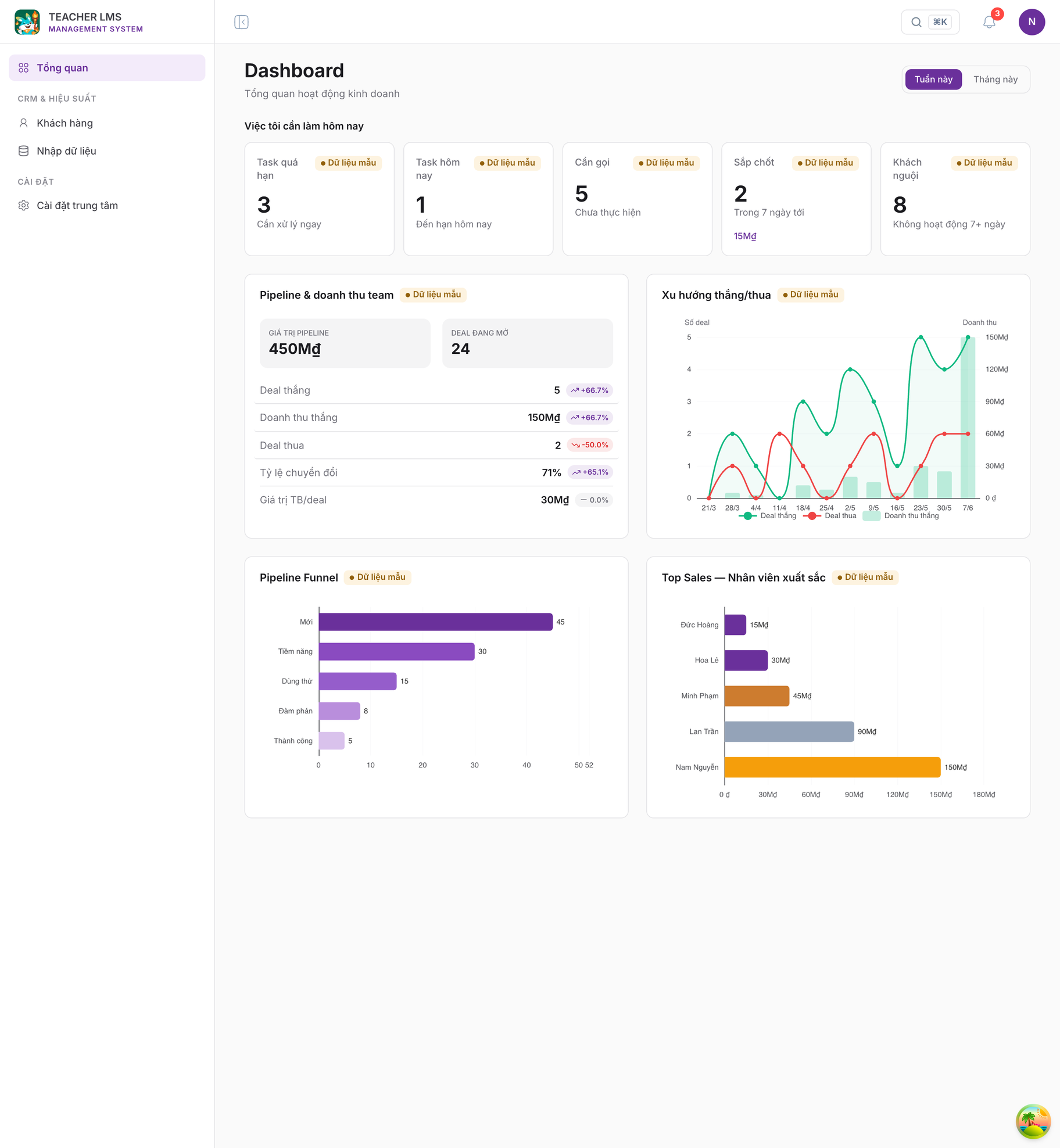
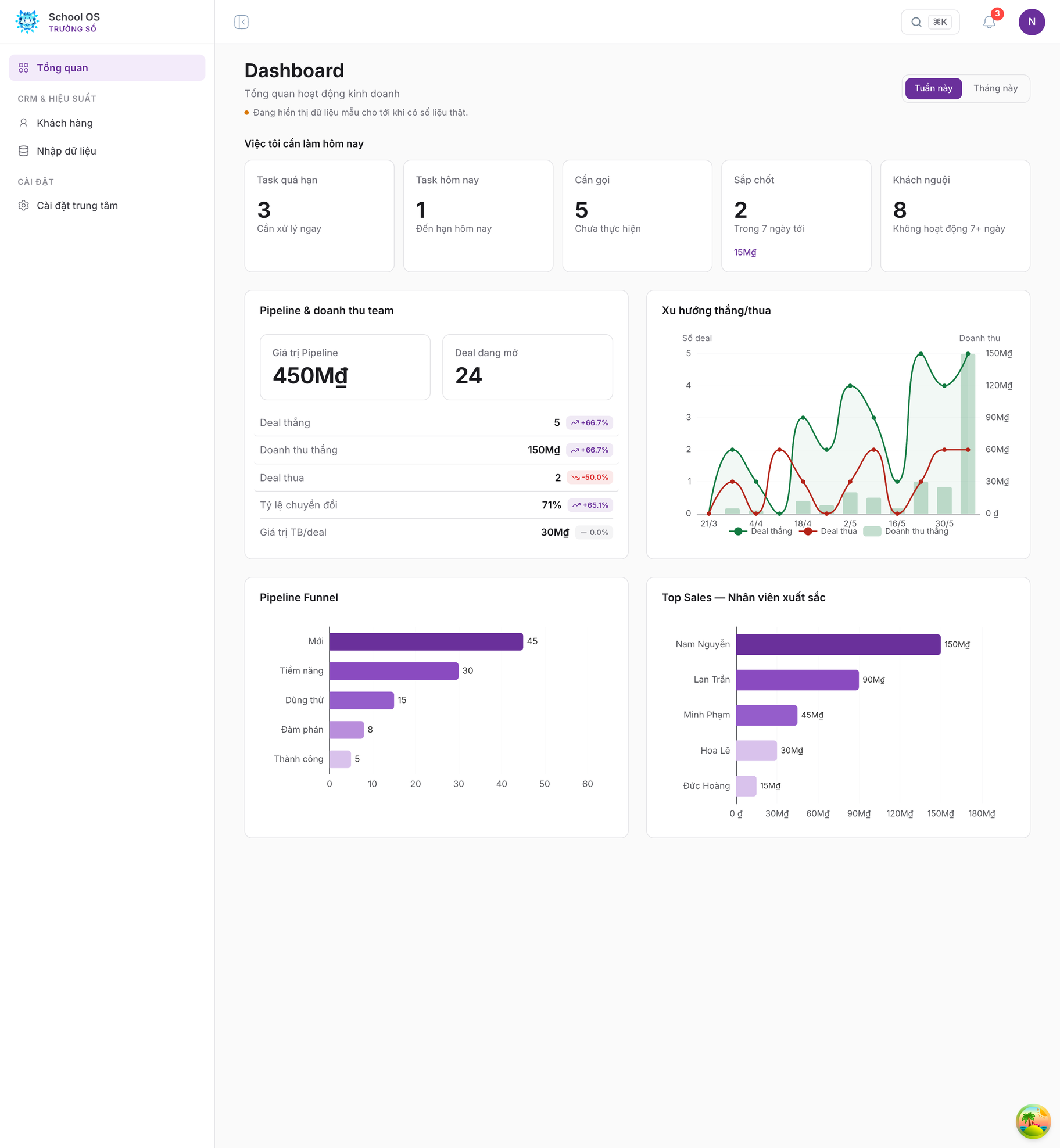
- The Top Sales ranking listed the weakest seller first, because the charting library lays category axes bottom-up; it is now inverted so the leader is on top, using the purple ramp rather than three medal colours.
- The "pipeline value" and "open deals" figures sat on grey inset boxes with 10 px uppercase labels; they now use the same tile as the five KPI tiles above them.
- The "sample data" badge repeated nine times, once per card, breaking the KPI labels onto two lines; it is now stated once beneath the page title.
- The won and lost series take the system's status colours; the funnel axis rounds up to a clean tick instead of ending on an odd value that collided with the neighbouring label.
- Hovering a list row turns grey; the purple fill is kept for the selected state.
- Chart text used to render in the browser's default face: charts draw to canvas, where
ctx.fonthas no cascade and so discardsinherit. The theme's font stack is now passed to the chart directly. The mismatch was clearest on hover, because the tooltip is a DOM node and did inherit correctly, appearing right beside axis labels that did not. - The sidebar is renamed School OS · Trường Số and carries the official logo.
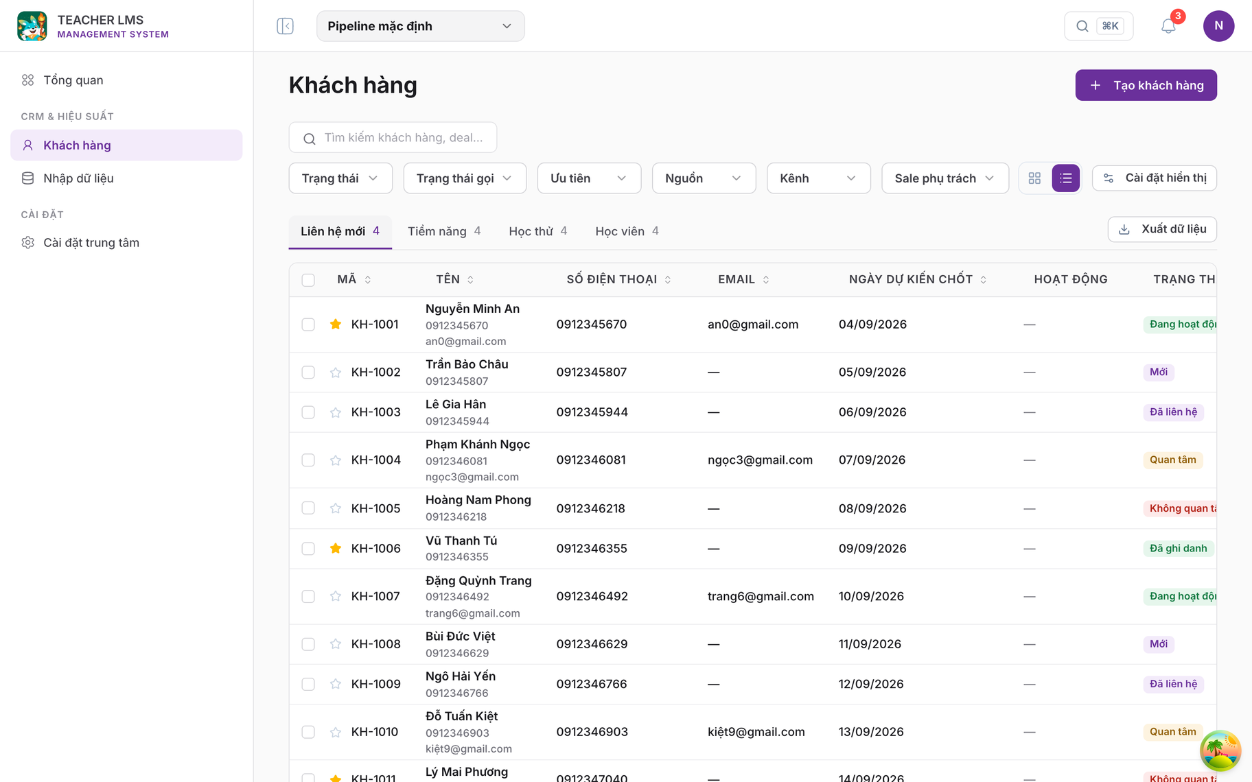
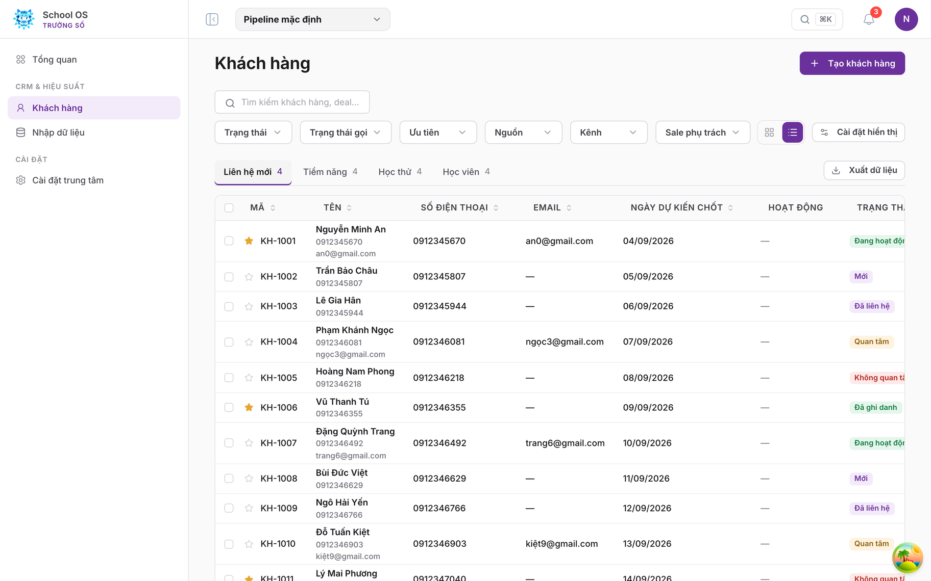
- The blue-leaning grey ramp moves onto the system's neutrals across all secondary text, borders and fills.
- Status labels change from pills to 6 px rounded rectangles in the four conventional colours.
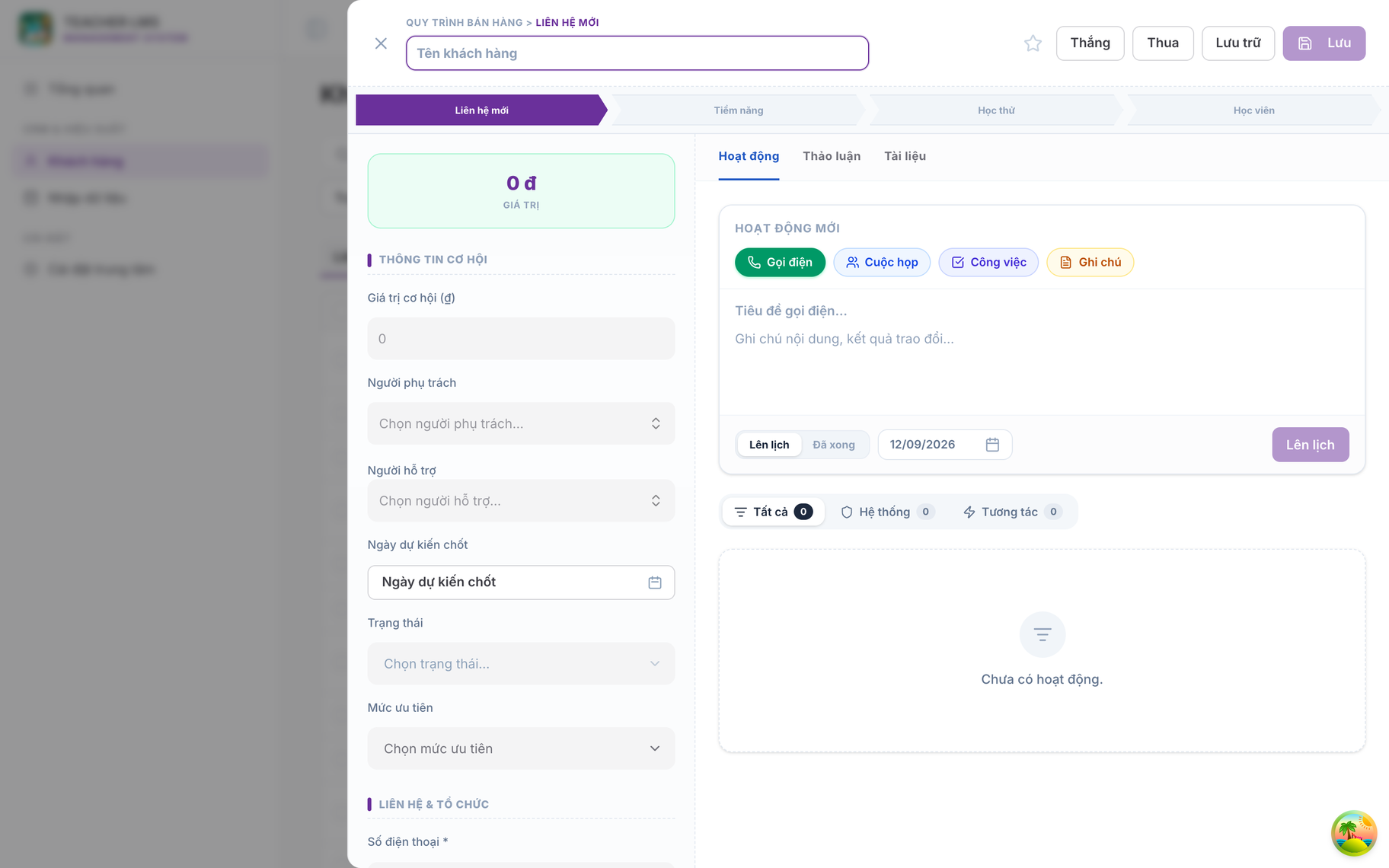
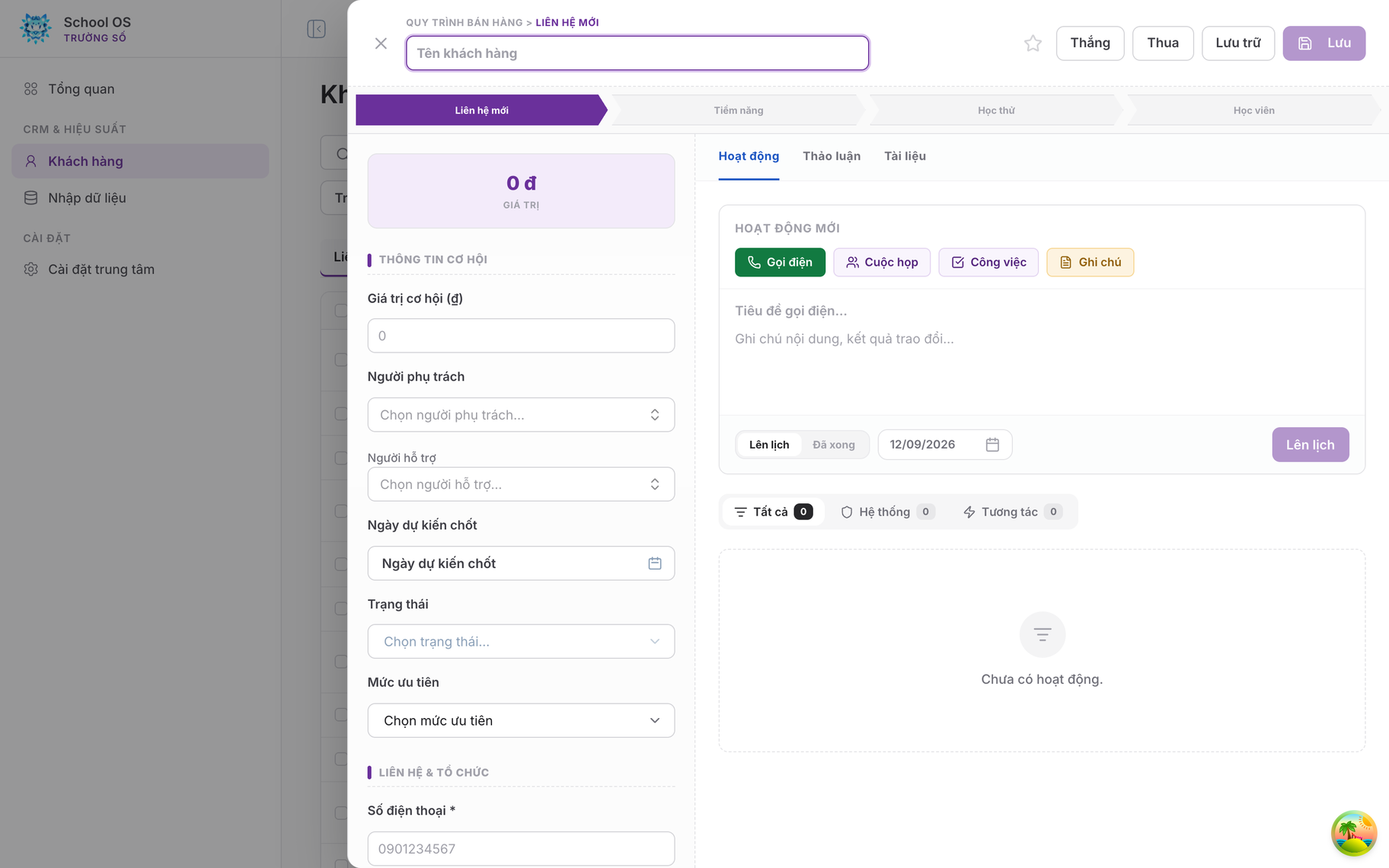
- Form fields become white, bordered
#d4d4d8, 36 px tall, with a purple border and halo on focus. - The opportunity value tile moves from a green fill to the brand's soft purple; green is reserved for the "good" status.
- Activity type labels take the 6 px radius and the four conventional colours; the stage band becomes one flat colour, dropping its gradient and shadow.
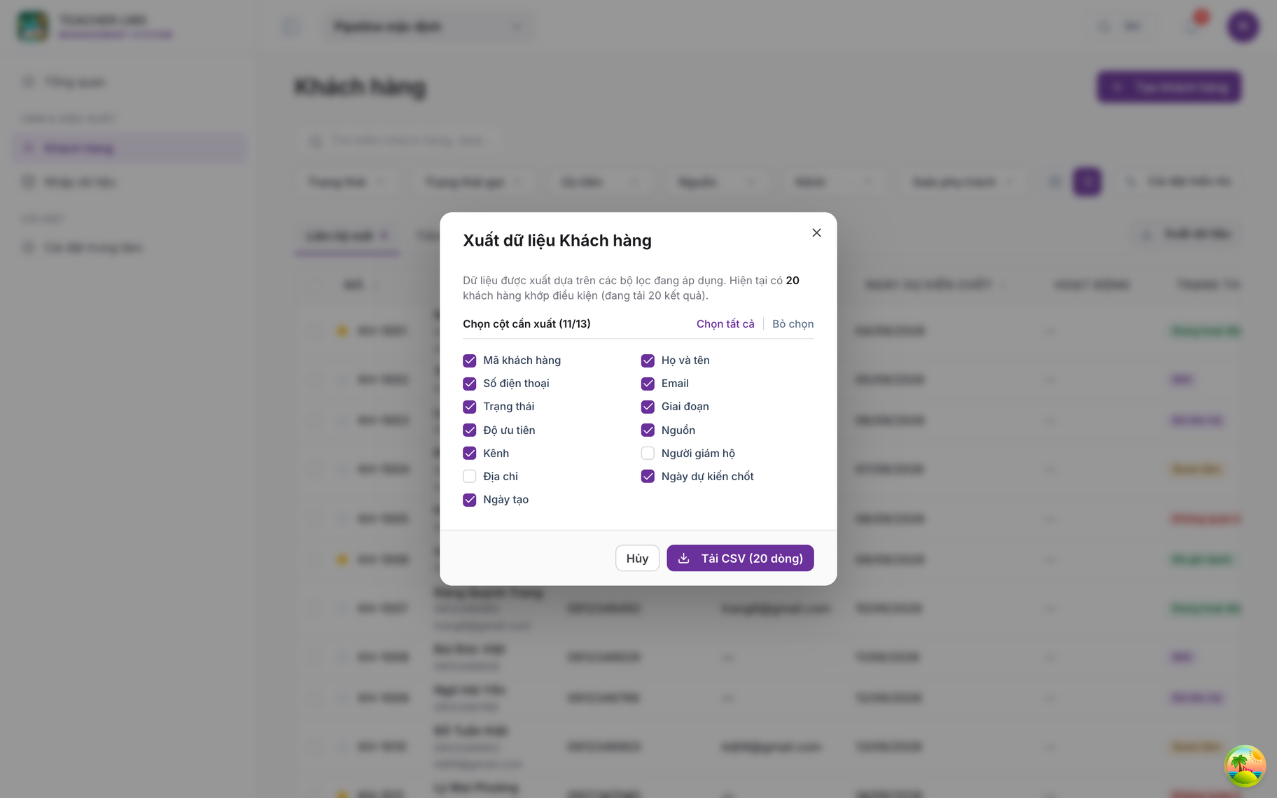
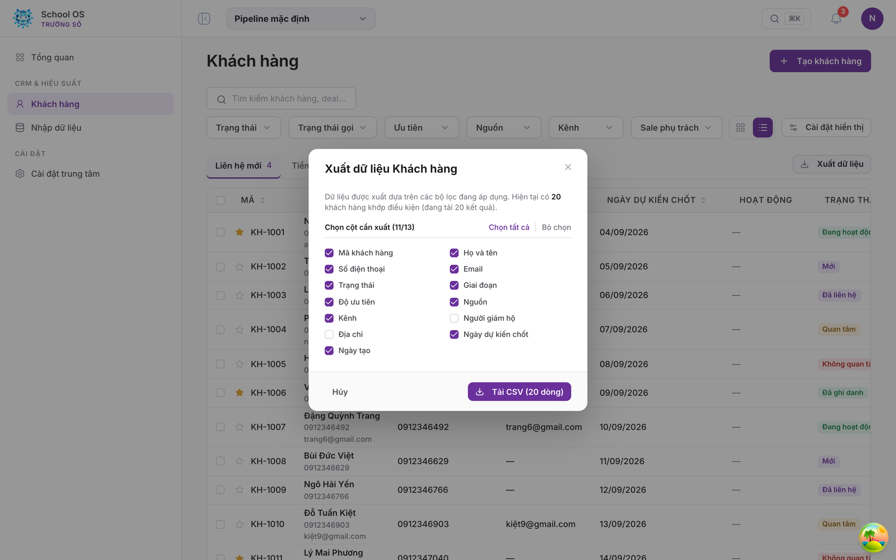
- 14 px radius, a
#fafafafooter separated by a rule, Cancel rendered flat at the far left, and the action pair to the right. - The overlay uses exactly
rgba(24,24,27,.45)and does not blur what sits behind it.
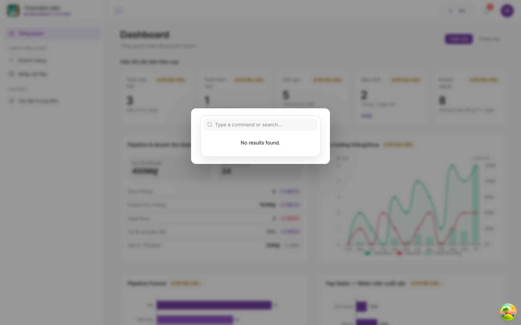
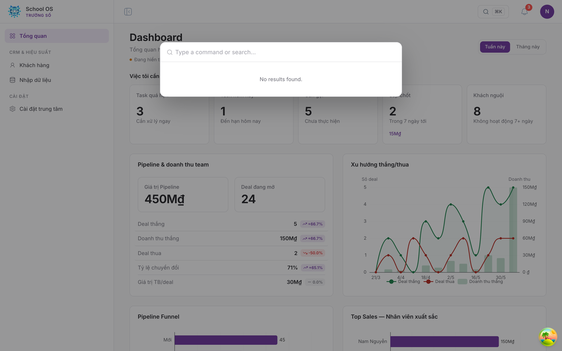
- A 620 px box, a 50 px borderless input separated by a rule, and a results list inset 6 px with each row on an 8 px radius.
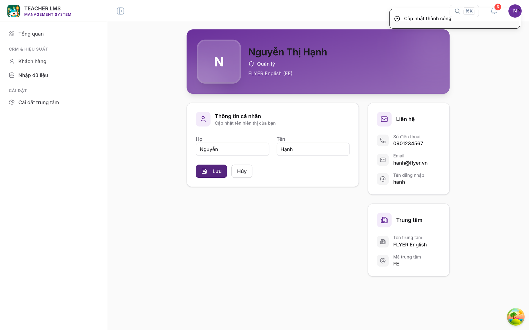
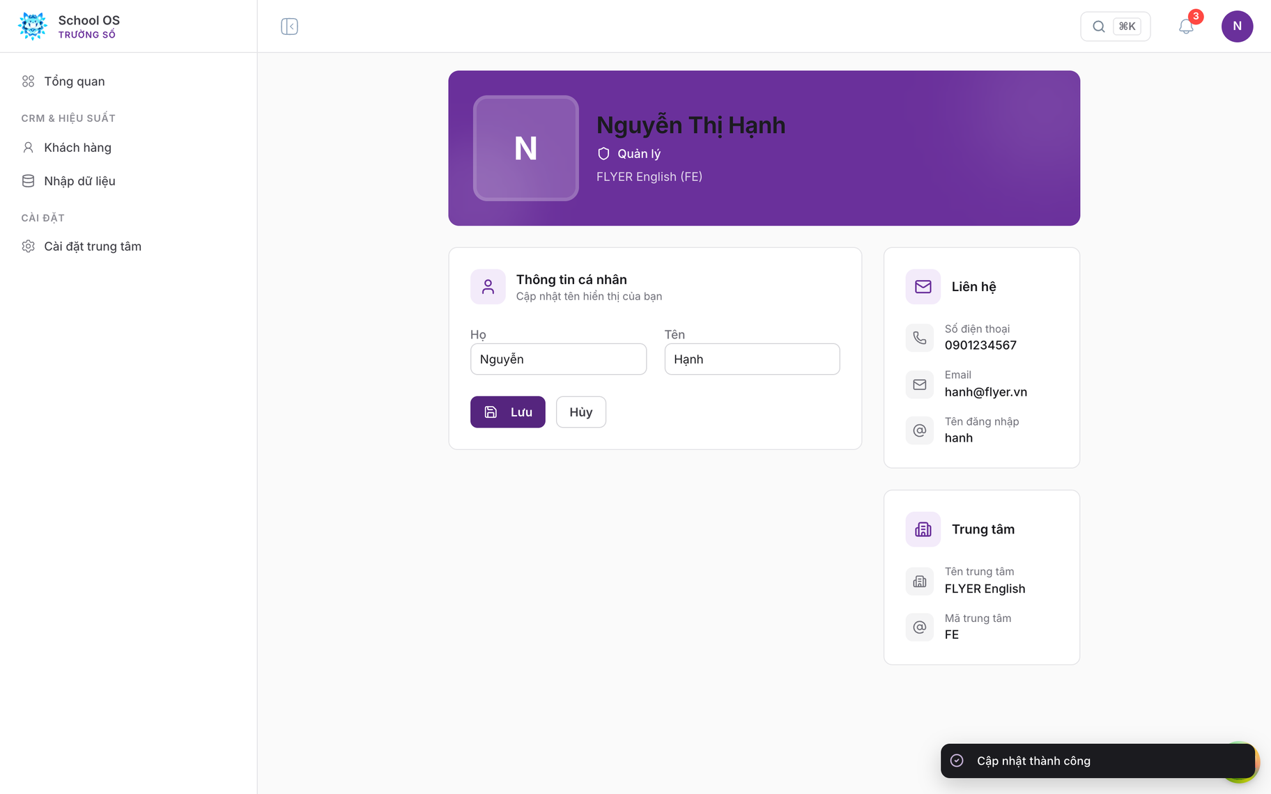
- One toast style for every type: a
#1b1b1fground, white text, 10 px radius, bottom right. - The account header band drops its gradient and shadow for a single flat colour.
6Per-component rules
The table below extends the specification: for each component it does not cover, the document records the values applied, so later work has one consistent reference.
| Component | Source | Values applied |
|---|---|---|
| Dropdown menu | enterprise | 6 px inset, rows 7 px by 10 px on an 8 px radius, grey hover, purple text for the selected row, 11 px uppercase group labels |
| Toast | enterprise | #1b1b1f ground, white 13 px text, 10 px radius, bottom right, one style for every type |
| Tooltip | enterprise | Ink ground, white 12.5 px text, 8 px radius |
| Callout | specification, suggestion card | #f9f5fd ground, #e4d5f1 border, purple 13.5 px title, 12.5 px body |
| Drawer | enterprise | Header and footer separated by rules, #fafafa footer, 15 px title |
| Command palette | enterprise | 620 px wide, 50 px borderless input, list inset 6 px, rows on an 8 px radius |
| Switch | enterprise | 30 px by 17 px track, 13 px thumb, purple when on |
| Progress bar | specification | 6 px tall, 3 px radius, #eeeef0 track, purple fill |
| Forms | specification, dialog | 13 px bold label above the control, 12.5 px help and error text |
| Charts | specification | 11.5 px axis labels, the purple ramp for the primary series, status colours only where they carry status meaning |
7Verification and open items
Verification results: the grey variable resolves to #71717a; status labels measure 6 px; no element still carries a utility shadow; the overlay no longer blurs; menus sit on a 10 px radius; the toast ground is #1b1b1f; and every field in the drawer is 36 px, white, bordered #d4d4d8. Type checking, linting and the production build all pass with no new findings.
Three items awaiting agreement
- The
blueramp currently maps to the brand purple. That follows the specification's single-accent principle, but gives up blue as a neutral informational colour. Confirmation is needed that this is the intended trade. - The "sample data" badge is now hidden at the card level and stated once beneath the page title. Confirmation is needed that this level of reminder is sufficient.
- Table column headers: the specification's prose asks for 12 px uppercase, while the sample CSS shipped alongside it does not uppercase them. This document follows the prose. Confirmation is needed so the reference frames can be updated.
Trường Số (truongso.net) · FLYER internal